The first step in the analysis of multivariate data is visualization. Histograms of attribute distributions, scatterplots, box-and-whiskers diagrams, parallel coordinate plots, self organizing maps, and even plots of happy faces - are all means of helping a human to visually comprehend multidimensional data and expoit the enormous power of the human brain to detect patterns. Of all these techniques, two-dimensional scatterplots are perhaps the most popular, as they tend to provide an especially "realistic" feel for the data. But when your data has more than two attributes (perhaps hundreds or thousands), how do you choose the two projection coordinates that would provide you with the "best angle" on the data?
The easiest answer to that question is, of course, to pick a pair of attributes Ai and Aj, and simply plot one versus the other. Unfortunately, this doesn't usually work well, especially when the dataset does have hundreds of attributes. Therefore, the most popular approach in practice is to use PCA and project the data onto the two largest principal components, which mostly results in a rather insightful image.
The PCA projection is, however, completely unsupervised. If your data has class labels assigned to points, PCA does not take them into account. No matter what is the labeling, PCA will always produce the same projection onto the coordinates with the highest variation. This might leave an improper impression that the two classes overlap a lot when in fact they do not. Therefore, this is not what you need. Usually, in the case of labeled data you expect from a scatterplot to provide an indication of how separated the two classes are from each other, and how difficult could it be to discriminate between them. It turns out that it is very easy to construct a linear projection with such properties.
The Linear classifier-based Scatterplot
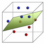
Assume there are two classes in the data and we are interested in a linear projection, that demonstrates how separated the classes are. Let us train a linear classifier to discriminate the two classes. It does not matter which algorithm you use, as long as it results in a separating hyperplane. Now naturally, the normal to this hyperplane is the main coordinate of interest to you: it is the direction along which the data will be classified linearly by your algorithm. If there is a coordinate for demonstrating separation, this must be it. The choice of the second projection coordinate does not matter much, so I would propose picking any direction orthogonal to the first.
When you have three classes you could select the first projection coordinate as the normal of a hyperplane, separating the first class from the second, and the second coordinate as the normal of a hyperplane, separating the first class from the third.
Finally, note that in general you need not limit yourself to linear classifiers only. Any classifier of the form ![]() will provide you with an informative coordinate projection function
will provide you with an informative coordinate projection function ![]() . This is a natural "supervised" alternative to kernel-PCA or SOM.
. This is a natural "supervised" alternative to kernel-PCA or SOM.
Naive supervised linear scatterplot (NS-plot)
To be somewhat more specific, here's a suggestion of a very simple implementation for the abovementioned idea. To avoid the use of a potentially complicated linear classifier training algorithm, let us just pick the vector connecting the means of the two classes as the first projection coordinate. The second coordinate is chosen at random and then orthogonalized with the first one. The Scilab code of the whole algorithm is therefore the following:
  // Input:
  //   X - the data matrix (instances in rows, attributes in columns)
  //   C - class assignments (C(i) is the class of instance X(i,:))
  mean_1 = mean(X(C ==  1, :), 'r')';
  mean_2 = mean(X(C == -1, :), 'r')';
  v1 = (mean_2 - mean_1)/norm(mean_2 - mean_1);
  v2 = rand(v1);
  v2 = v2 - v2'*v1*v1;
  v2 = v2/norm(v2);
  X_proj = X*[v1 v2];
  // Output:
  //   X_proj - the projected coordinates
Notice how much simpler and more efficient it is than PCA. Despite the simplicity, I haven't seen the use of such a plot anywhere else, so let me coin the boring name NS-plot for it. Personal experience shows that the resulting plot is visually never much worse than a PCA plot, and most often the two plots complement each other. Let me illustrate that on two simple examples.
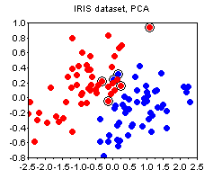
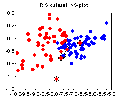
The IRIS dataset. The plots below show the PCA and the NS plots of the famous iris dataset (where I removed the first class). There is clearly no strong advantage of one plot over the other except that PCA is more difficult to compute.
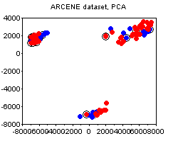
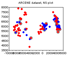
The ARCENE dataset. The following plots depict the 1000-attribute ARCENE sample dataset. We can see how PCA prefers to stress the unsupervised clustering present in the dataset, thus potentially deemphasizing the specifics of class labeling. In this case, I would say, the PCA and the NS plots complement each other.
Bonus
Noticed the circled points on the plots above? This is one other small trick that I find quite useful, and that does not seem to be widely known. The circled points denote the "boundary" - these are the points whose nearest neighbor is of a different class than their own. The more boundary points there are - the more difficult is the classification problem. The boundary is not an absolute notion, because there are various ways to define distance between points. My suggestion would be to standardize all attributes and use the euclidean norm, unless you have good reasons to do something else (e.g. you a-priori know good weights for the attributes, etc).
