Early stopping is a technique that is very often used when training neural networks, as well as with some other iterative machine learning algorithms. The idea is quite intuitive - let us measure the performance of our model on a separate validation dataset during the training iterations. We may then observe that, despite constant score improvements on the training data, the model's performance on the validation dataset would only improve during the first stage of training, reach an optimum at some point and then turn to getting worse with further iterations.
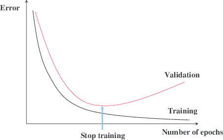
The early stopping principle
It thus seems reasonable to stop training at the point when the minimal validation error is achieved. Training the model any further only leads to overfitting. Right? The reasoning sounds solid and, indeed, early stopping is often claimed to improve generalization in practice. Most people seem to take the benefit of the technique for granted. In this post I would like to introduce some skepticism into this view or at least illustrate that things are not necessarily as obvious as they may seem from the diagram with the two lines above.
How does Early Stopping Work?
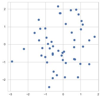
To get a better feeling of what early stopping actually does, let us examine its application to a very simple "machine learning model" - the estimation of the mean. Namely, suppose we are given a sample of 50 points  from a normal distribution with unit covariance and we need to estimate the mean
  of this distribution.
Sample
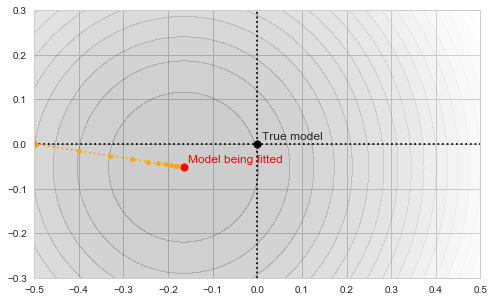
The maximum likelihood estimate of can be found as the point which has the smallest sum of squared distances to all the points in the sample. In other words, "model fitting" boils down to finding the minimum of the following objective function:
![\[f_\mathrm{train}(\mathrm{w}) := \sum_{i=1}^{50} \Vert \mathbf{x}_i - \mathbf{w}\Vert^2\]](https://fouryears.eu/wp-content/ql-cache/quicklatex.com-4a4ff04b2699f9033f5d09897e4dfc5e_l3.png "Rendered by QuickLaTeX.com")
As our estimate is based on a finite sample, it, of course, won't necessarily be exactly equal to the true mean of the distribution, which I chose in this particular example to be exactly (0,0):

Sample mean as a minimum of the objective function
The circles in the illustration above are the contours of the objective function, which, as you might guess, is a paraboloid bowl. The red dot marks its bottom and is thus the solution to our optimization problem, i.e. the estimate of the mean we are looking for. We may find this solution in various ways. For example, a natural closed-form analytical solution is simply the mean of the training set. For our purposes, however, we will be using the gradient descent iterative optimization algorithm. It is also quite straightforward: start with any point (we'll pick (-0.5, 0) for concreteness' sake) and descend in small steps downwards until we reach the bottom of the bowl:
Gradient descent
Let us now introduce early stopping into the fitting process. We will split our 50 points randomly into two separate sets: 40 points will be used to fit the model and 10 will form the early stopping validation set. Thus, technically, we now have two different objective functions to deal with:
![\[f_\mathrm{fit}(\mathrm{w}) := \sum_{i=1}^{40} \Vert \mathbf{x}_i - \mathbf{w}\Vert^2\]](https://fouryears.eu/wp-content/ql-cache/quicklatex.com-5adb94ca761b724a00c38b830a6bd831_l3.png "Rendered by QuickLaTeX.com")
and
![\[f_\mathrm{stop}(\mathrm{w}) := \sum_{i=41}^{50} \Vert \mathbf{x}_i - \mathbf{w}\Vert^2.\]](https://fouryears.eu/wp-content/ql-cache/quicklatex.com-8ac10bff72d2e3925e207369119b4537_l3.png "Rendered by QuickLaTeX.com")
Each of those defines its own "paraboloid bowl", both slightly different from the original one (because those are different subsets of data):
Fitting and early stopping objectives
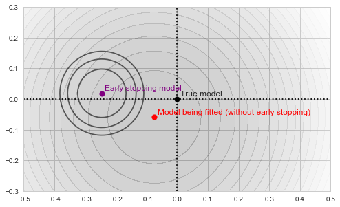
As our algorithm descends towards the red point, we will be tracking the value of  at each step along the way:
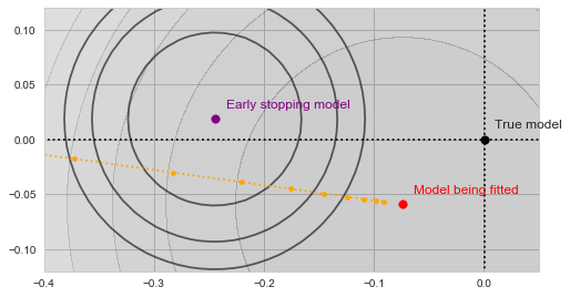
Gradient descent with validation
With a bit of imagination you should see on the image above, how the validation error decreases as the yellow trajectory approaches the purple dot and then starts to increase after some point midway. The spot where the validation error achieves the minimum (and thus the result of the early stopping algorithm) is shown by the green dot on the figure below:
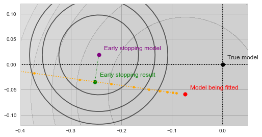
Early stopping
In a sense, the validation function now acts as a kind of a "guardian", preventing the optimization from converging towards the bottom of our main objective. The algorithm is forced to settle on a model, which is neither an optimum of  nor of . Moreover, both and use less data than
  , and are thus inherently a worse representation of the problem altogether.
So, by applying early stopping we effectively reduced our training set size, used an even less reliable dataset to abort training, and settled on a solution which is not an optimum of anything at all. Sounds rather stupid, doesn't it?
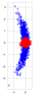
Indeed, observe the distribution of the estimates found with (blue) and without (red) early stopping in repeated experiments (each time with a new random dataset):
Solutions found with and without early stopping
As we see, early stopping greatly increases the variance of the estimate and adds a small bias towards our optimization starting point.
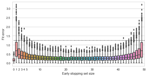
Finally, let us see how the quality of the fit depends on the size of the validation set:
Fit quality vs validation set size
Here the y axis shows the squared distance of the estimated point to the true value (0,0), smaller is better (the dashed line is the expected distance of a randomly picked point from the data). The x axis shows all possible sizes of the validation set. We see that using no early stopping at all (x=0) results in the best expected fit. If we do decide to use early stopping, then for best results we should split the data approximately equally into training and validation sets. Interestingly, there do not seem to be much difference in whether we pick 30%, 50% or 70% of data for the validation set - the validation set seems to play just as much role in the final estimate as the training data.
Early Stopping with Non-convex Objectives
The experiment above seems to demonstrate that early stopping should be almost certainly useless (if not harmful) for fitting simple convex models. However, it is never used with such models in practice. Instead, it is most often applied to the training of multilayer neural networks. Could it be the case that the method somehow becomes useful when the objective is highly non-convex? Let us run a small experiment, measuring the benefits of early stopping for fitting a convolutional neural-network on the MNIST dataset. For simplicity, I took the standard example from the Keras codebase, and modified it slightly. Here is the result we get when training the the most basic model:
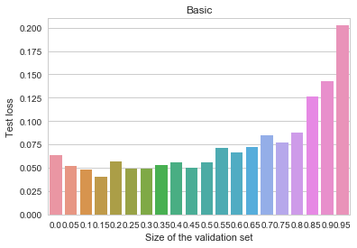
MNIST - Basic
The y axis depicts log-loss on the 10k MNIST test set, the x axis shows the proportion of the 60k MNIST training set set aside for early stopping. Ignoring small random measurement noise, we may observe that using early stopping with about 10% of the training data does seem to convey a benefit. Thus, contrary to our previous primitive example, when the objective is complex, early stopping does work as a regularization method. Why and how does it work here? Here's one intuition I find believable (there are alternative possible explanations and measurements, none of which I find too convincing or clear, though): stopping the training early prevents the algorithm from walking too far away from the initial parameter values. This limits the overall space of models and is vaguely analogous to suppressing the norm of the parameter vector. In other words, early stopping resembles an ad-hoc version of  regularization.
Indeed, observe how the use of early stopping affects the results of fitting the same model with a small  -penalty added to the objective:
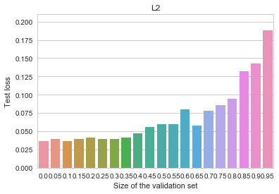
MNIST - L2
All of the benefits of early stopping are gone now, and the baseline (non-early-stopped, -regularized) model is actually better overall than it was before. Let us now try an even more heavily regularized model by adding dropout (instead of the penalty), as is customary for deep neural networks. We can observe an even cleaner result:
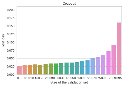
MNIST - Dropout
Early stopping is again not useful at all, and the overall model is better than all of our previous attempts.
Conclusion: Do We Need Early Stopping?
Given the reasoning and the anecdotal experimental evidence above, I personally tend to think that beliefs in the usefulness of early stopping (in the context of neural network training) may be well overrated. Even if it may improve generalization for some nonlinear models, you would most probably achieve the same effect more reliably using other regularization techniques, such as dropout or a simple penalty.
Note, though, that there is a difference between early stopping in the context of neural networks and, say, boosting models. In the latter case early stopping is actually more explicitly limiting the complexity of the final model and, I suspect, might have a much more meaningful effect. At least we can't directly carry over the experimental examples and results in this blog post to that case.
Also note, that no matter whether early stopping helps or harms the generalization of the trained model, it is still a useful heuristic as to when to stop a lengthy training process automatically if we simply need results that are good enough.


")

 and are faced with a task of devising a generic function of the sample, which could only depend on the values in the sample, but not on the ordering of these values. Alternatively, you might need to prove that a given statistic is constant with respect to all permutations of the sample. Finally, you might simply wish to have a convenient mapping for your feature vectors that would lose the ordering information, but nothing else.
 instead of the original values. This is not always convenient. Firstly, the mapping of the original sample to the corresponding vector of order statistics (i.e. the sorting operation) is quite complicated to express mathematically. Secondly, the condition that the vector of order statistics is always sorted is not very pleasant to work with. A much better idea is to represent your data as a polynomial of the form
![\[p_x(z) = (z+x_1)(z+x_2)\dots(z+x_n)\,.\]](https://fouryears.eu/wp-content/ql-cache/quicklatex.com-94163d03c79ea3aa11a4ac2b7c774f8a_l3.png "Rendered by QuickLaTeX.com")
 and
and  are equal if and only if their roots are equal, which means, in our case, that the samples
  and
and  are equal up to a reordering.
![\[p_x(z) = z^n + a_1z^{n-1} + \dots + a_n\,,\]](https://fouryears.eu/wp-content/ql-cache/quicklatex.com-bd02693c68612db99debeb8854dbd539_l3.png "Rendered by QuickLaTeX.com")
 different points (e.g. at
  ) - in any case we end up with the same amount of data as we had originally (i.e.
  time to compute. Secondly, not every polynomial will have
 will provide you with an informative coordinate projection function
  . This is a natural "supervised" alternative to kernel-PCA or SOM.