• Posted by Konstantin 23.01.2012 2 Comments

    Visualization is a very powerful method for data analysis. Very often, plotting a bunch of scatterplots, barplots, heatmaps, animations or other kinds of imagery is enough to immediately see by your own eyes, whether there are any interesting patterns in the data (which often means you have nearly solved the problem) or not (which means you should prepare yourself for a long-term battle with the data which might not end up succesfully for you).

    Visualization is powerful because by visualizing data you essentially "plug it" directly into your brain's processing engine, using the visual interface that happens to be supported by your brain. You need to convert the data into CSV or an XLS format to load it into Excel. Analogously, you need a 2d image or an animation to load the data into your brain - it is that simple.

    This view suggests two immediate developments. Firstly, why don't we use the other "interfaces" that our brain has with the outside world for data processing? Could converting data to something which sounds, feels, tastes or smells be a useful method for exploiting our brain's analytic capabilities even further? Obviously, visual input has the most impact simply due to the fact that the retina is an immediate part of the brain. However, auditory signals, for example, seem to have a powerful processing system in our brain dedicated to them too.

    Secondly, if we can appreciate how much our brain is capable of extracting from a single image, why don't we try to automate such an approach? Modern computer vision has reached sufficient maturity to be capable of extracting fairly complex informative features from images. This suggests that a particular 2d plot of a dataset can be used as a kind of an informative "data fingerprint" which, when processed by a computer vision-driven engine, could be analyzed on the presence of "visible" patterns and visual similarity to other datasets.

    The fun part is that there has been some research done in this direction. Consider the paper "Computer Vision for Music Identification" by Yan Ke et al. The authors propose to convert pieces of music into a spectrogram image. Those spectrogram images can then be compared to each other using methods of computer vision, thus resulting in an efficient similarity metric, usable for search and identification of musical pieces. The authors claim to achieve 95% precision at 90% recall, which compares favourably to alternative methods. I think it would be exciting to see more of such techniques applied in a wider range of areas.
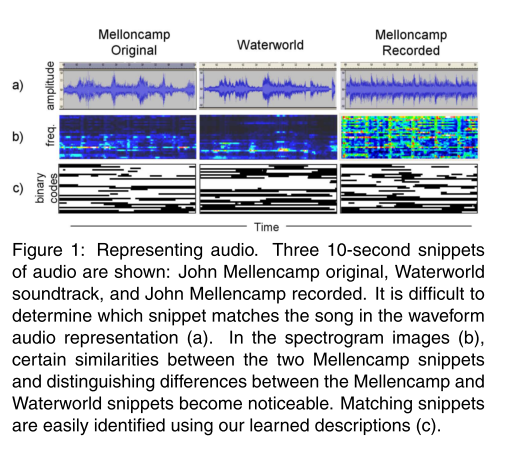
     

    Representing audio as pictures, figure from (Y.Ke, 2005)

    Representing audio as pictures, figure from (Y.Ke, 2005)

    Tags: , , , ,

  • Posted by Konstantin 16.01.2012 No Comments

    This post presumes you are familiar with PCA.

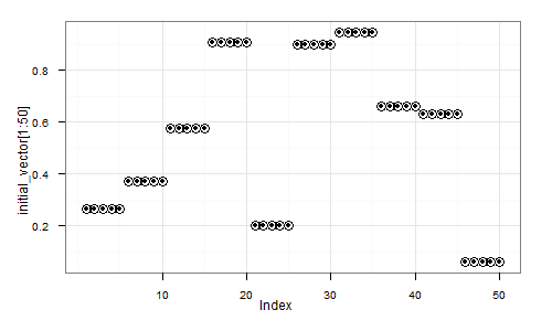
    Consider the following experiment. First we generate a random vector (signal) as a sequence of random 5-element repeats. That is, something like

    (0.5, 0.5, 0.5, 0.5, 0.5,   0.9, 0.9, 0,9, 0.9, 0,9,   0.2, 0.2, 0.2, 0.2, 0.2,   ... etc ... )

    In R we could generate it like that:

    num_steps = 50
    step_length = 5;
    initial_vector = c();
    for (i in 1:num_steps) {
      initial_vector = c(initial_vector, rep(runif(1), step_length));
    }

    Here's a visual depiction of a possible resulting vector:

    Initial random vector

    plot(initial_vector), zoomed in

    Next, we shall create a dataset, where each element will be a randomly shifted copy of this vector:

    library(magic) # Necessary for the shift() function
    dataset = c()
    for (i in 1:1000) {
      shift_by = floor(runif(1)*num_steps*step_length) # Pick a random shift
      new_instance = shift(initial_vector, shift_by)   # Generate a shifted instance
      dataset = rbind(dataset, new_instance);          # Append to data
    }

    Finally, let's apply Principal Component Analysis to this dataset:

    pca = prcomp(dataset)

    Question - how do the top principal components look like? Guess first, then read below for the correct answer.

    Read more...

    Tags: , ,

  • Posted by Konstantin 10.01.2012 No Comments

    It is not uncommon when a long-running scientific study or an experiment produces results which are, at best, uninteresting. The measured effect may be too weak to be reported on convincingly given the data at hand. None the less, resources have been put into it, many man-months have been spent, and thus a paper must be published. The researcher must therefore present his results in a way convincing enough for the reviewers to be lulled into acceptance.

    The following are the three best methods for doing that (and I have seen those being used in practice). Next time you read someone's paper (or write your own), keep them in mind.

    1. Use an irrelevant (and preferably strict) hypothesis test.
      Suppose you want to show that a set of measurements in one group differs from the set of measurements in the other group. The typical approach here is the T-test or the Wilcoxon test, both of which detect whether elements in one group are on average greater than those in the other group. If, however, you find that the tests fail on your data (i.e., there is no easily detectable difference in measurement magnitudes), why don't you try something like the Kolmogorov-Smirnov test, which checks whether the distributions of the two groups are different. It is a much stricter condition. In fact the tiniest outlier in your data will easily get you a low p-value and thus something to stick in the face of a reviewer. If even the KS test did not work, try testing something even less relevant, such as, whether your data is normally distributed. Most probably it is not, here's your low p-value! Remember - the smaller your p-values, the better is your paper!
    2. Avoid significance testing completely
      If you can't get a low p-value anywhere, do not worry. Significance testing is going somewhat out of fashion nowadays anyway, so it is possible to avoid it and still sound convincing. If one group of measurements has 40% of successes and the other has 42% - why not simply present those two numbers as obvious proof that the second group is better. Using ratios is also a smart idea. Say, some baseline algorithm has a 1% chance of success. You now test your algorithm and discover that out of 10 trials it had 1 success. That means your algorithm has just demonstrated a 10% success rate, which is ten times better than the baseline! Finally, ROC curves can often be used to hide the fact that your data is too tiny to make any conclusions. No one really ever checks for significance of those.
    3. Sweep multiple testing under the carpet
      If you are analyzing a dataset with 1000 attributes and 50 datapoints, it is not really very surprising if one of those attributes will seem "interesting" (e.g. highly correlated with the target effect) purely by chance - there is often nothing significant in finding one out of a thousand. However, if you only mention that one (or perhaps 10-50) of the original attributes, your results will magically become significant and no reviewer will be able to catch your cheating.

    There are certainly more, and I'll keep the post updated if I come up with a worthy addition. If you have something to add, please do comment.

    Tags: , , ,