The Receiver Operating Characteristic Area Under the Curve (ROC AUC) is a measure of classifier performance, which is widely used in machine learning. Unfortunately, the obscure way the concept is explained in most sources makes it fairly hard to grasp its intuitive meaning. The name "area under the curve" itself is ill-conceived and is utterly useless in helping the intution. The aim of this post is to aid those struggling with the concept, and also present a simple and intuitive interpretation of the ROC AUC metric as the "average positive rank" which I, so far, have not seen stated explicitly elsewhere.
To facilitate explanation, let us consider a hypothetical classification problem: classifying chocolate bars to "very good" or "just OK" (hereby we presume a chocolate bar may not be considered "bad" by definition of chocolate). Suppose we have a sample of particular chocolate bar types, for which we have carefully assigned the proper classification, e.g.:
| Item | Class |
|---|---|
| Mars | 0 |
| Milka | 1 |
| Kalev | 0 |
| Lindt | 1 |
| Ferrero-Rocher | 1 |
| Laima | 0 |
| Hershey's | 0 |
where class label "1" denotes "very good" and "0" means "just OK". Suppose we have derived a classifier which, based on some features of a chocolate bar, such as its chocolate content, packaging, country of origin, etc, attempts to assign a "goodness score" which should resemble our notion of goodness. For concreteness' sake, let us say the classifier assigned the following scores:
| Item | True class | Assigned score |
|---|---|---|
| Milka | 1 | 8 |
| Mars | 0 | 5 |
| Lindt | 1 | 3 |
| Ferrero-Rocher | 1 | 3 |
| Kalev | 0 | 1 |
| Laima | 0 | -3 |
| Hershey's | 0 | -5 |
How do we assess the goodness of such a classifier? The "ROC approach" suggests we do the following. First, we shall plot a ROC curve. To do that, we order the chocolate bars according to their assigned score (this is already done in the table above) and use this ordering to write out the vector of the class labels (the "sorted prediction vector"):
| Highest rated item's true class | Lowest rated item's true class | |||||
|---|---|---|---|---|---|---|
| 1 | 0 | 1 | 1 | 0 | 0 | 0 |
Obviously, the best possible classifier would order the instances so that all the ones would be on the left of all the zeroes. The particular classifier we chose here looks good, but not perfect.
Next, we use the obtained vector to plot the ROC curve. To do this plot, forget all of the "True Positive Rate" and "False Positive Rate" nonsense you might have read about in most textbooks, and follow the following simple recipe:
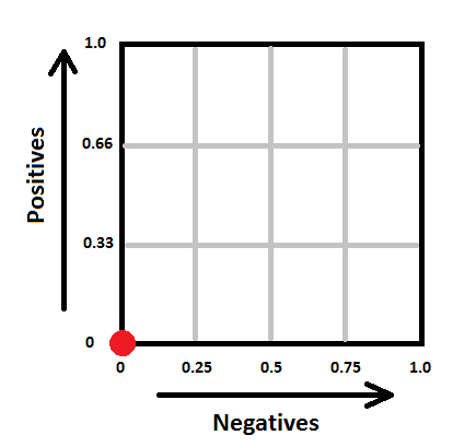
- Draw a square with sides of length 1. Denote its its lower left corner as the "origin", its horizontal axis as "the negatives" and its vertical axis as "the positives". Split the negatives axis in as many parts as there are examples of class "0" in the dataset. Split the positives axis in as many parts as there are examples of class "1" in your dataset. In our case, the square will look as follows:
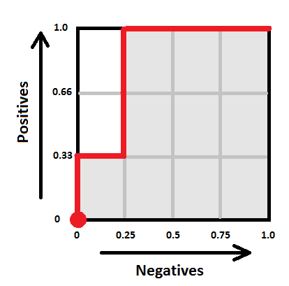
- Next, take the sorted prediction vector, and draw a path, starting from the origin. For each "1" in the sorted prediction vector, the path will move one step "up", and for each "0" in the vector, the path will move one step "right" (note that if you have multiple predictions with the same score, make all the corresponding "up" and "right" moves at once by drawing the corresponding diagonal). In our case, the path goes ("up", "right", "up", "up", "right", "right", "right") and hence looks as follows:
Voilà, this is your ROC curve. Obviously, the "perfect" classifier would make all the "up" steps first and the "right" steps last, hence the ideal ROC curve looks like a perfect corner. A random classifier would mix his "up" and "right" steps randomly, and the curve would most probably follow a diagonal-ish path. The one-number summary of the "goodness" of such a path is the "area under the curve" (coloured gray here), which will be 1.0 for the ideal case, and somewhere around 0.5 for the worst case. In our case the area is 10/12 ~ 0.83.
Here comes the important question — what does this number actually mean? One good answer is given by the following probabilistic interpretation:
The area under ROC curve specifies the probability that, when we draw one positive and one negative example at random, the decision function assigns a higher value to the positive than to the negative example.
There is, however, yet another, to my mind even more intuitive, interpretation. Define the rank of a positive example as the proportion of negative examples "to the right of it" in the sorted prediction vector. For example, if the sorted prediction vector is (1, 0, 0, 0, 0), then the rank of the sole positive item there is 1.0 (all negative examples are to the right). If the sorted prediction vector is (0, 0, 1, 0, 0), the rank is 0.5 (half of negative examples is to the right), and if the vector is (0, 0, 0, 0, 1), the rank is 0. In our chocolate bar example, the ranks of the positive examples are the following:
| Highest rated item's true class | Lowest rated item's true class | ||||||
|---|---|---|---|---|---|---|---|
| Sorted prediction vector | 1 | 0 | 1 | 1 | 0 | 0 | 0 |
| Rank | 1.0 | 0.75 | 0.75 | ||||
The "rank" thus denotes where would a classifier position a given positive item within the set of negative examples, whether closer to the "left" (rank 1) or closer to the "right" (rank 0).
Now the average rank of all the positive examples seems like a reasonable metric of classifier performance, doesn't it? In fact, is exactly the ROC AUC! Now the value of 0.80 ROC score can be interpreted intuitively as follows: "the average positive example has about 20% of negative examples scored higher than it". This, so far, seems to me personally to be the "simplest" interpretation of the ROC AUC. So write it down:
ROC AUC is the average positive rank.


Very nice and clear explanation.
Just a question : What would happen in case you considered more than 2 ranks - say, 0,1,2.. how would you explain that ranking with ROC curves? (To make it more clear, considered rating the chocolates 'Bad' also, in addition)
As far as I know, ROC analysis only makes sense for binary classifiers. As soon as you have to classify things into more than two classes things become more complicated.
Let's say you are classifying candy into "Milk", "Dark", "White" and "Other" types of chocolate. In this case it is not enough to simply have a function which ranks chocolates into some order, because, in contrast to the binary case, the rankings with respect to "milkness", "darkness" and "whiteness" do not necessarily correlate in some particular way.
There are two common ways to cast a multi-class problem in a set of binary classifications - "one versus all" and "all versus all". Those can be used both to construct multi-class classifiers from several binary classifiers and to analyze a given multi-class classifier by "decomposing" it.
In the first case ("one versus all") you take your multi-class classifier and turn it into several binary classifiers, one for each class. E.g. "milk vs non-milk", "dark vs non-dark", etc. You can then study all of those classifiers separately (e.g. compute ROC AUC, precision, recall, accuracy, for each of them). If you need to have one number in the end, you can average the results (weighted by the proportion of each class).
The second case ("all vs all") suggests you regard each pair of classes as a separate binary classification problem. E.g. you'd examine how good is your classifier at discriminating "milk vs dark", "milk vs white", "dark vs white", etc. Actually, I haven't actually seen this approach used to assess classifiers in practice, but it makes sense in theory.
Hope that relates to your question.
thanks for this write up. This is one of the most easiest explanation on AUC I found.
Thanks, this helped me a lot.
Thank you Konstatin, very clearly reasoned and written. It also helps to understand the range of AUC, and why 1 is better than 0.5.
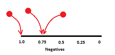
Yes it is the best explanation of ROC I have ever found. But one thing I could not understand. In the interpretation part how did you get 0.75? I guess for the 2nd '1' we are getting 0,75. But for the 3rd '1' why is it 0.75 again?
In both cases you have one zero on the left and three to the right, i.e. the corresponding "1" is positioned with 75% of all *zeroes* to one side of it.
In the image below, the black line is the space of *only* zeroes, where you kind-of "insert" the ones (red balls) at corresponding offsets.
Very good explanation. Thank you. If possible can you write/know an article on how an SVM works. It is very confusing for me as of now.
I won't probably find the time to do an SVM write-up any time soon, but perhaps you could check some of my lecture slides on the topic (it seems there's even a video available still). That lecture has this one as a prerequisite and this one as a compulsory follow-up. In addition, there are three practice sessions (based on R) to accompany the material. My hope is that if a student goes through those, he should feel more or less comfortable with the topic.
Thanks a lot. That is helpful. Just to confirm Concordance/C statistics and ROC AUC are the same thing, right?
I have never heard the term "Concordance statistic" myself, so the best I can do now is google for it. As far as my googling tells me, this is just a different name for "ROC AUC".
Do note that there is also a Concordance correlation coefficient metric (which, I guess, people may also refer to as simply "concordance" sometimes), and this is a different thing.
Awesomest explanation. May you find time to bless us with more of your stuff.
Great job man....Clear as day now!
Thank you for this really sweet explanation! (pun intended)
I liked your explanation.
Even though I do not understand the explanations using TPR/FPR fully (and I do not think it is worth understanding it fully), one thing I do understand is that the AUC is drawn by varying the threshold probability for declaring an example to belong to the positive class.
I do not think your explanation covers the role of the threshold value, no?
Cheers.
The actual threshold value plays no role here. Any monotonous transform of the classifier's output will produce the same ROC curve with the same AUC score.
Note that as you move through the sorted list of classifier outputs you are effectively going through the various threshold values without using those values explicitly.