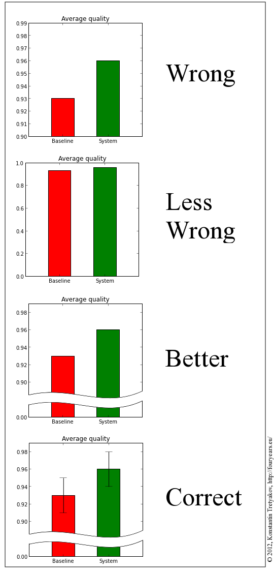
It is annoying how popular it is to ignore the Y-axis limits on bar charts nowadays. Unfortunately, this is also the default mode for most plotting packages, so no one wants to do anything about it. But something must be done.
Four Years Remaining
Preparing the consequences


I would add 5th graphic with units and put "Most correct" next to it. The whiskers are for showing minimum/maximum?
By units you mean the y-axis label? True, those are nice to have, but to my mind are not crucial. They are usually clear from the context and do not contribute much to the main aspect of the boxplot, namely that of "comparison".
My main point here is that barplots are abused so often nowadays, that when I see two bars on a plot, one twice as high as the other, I must consciously stop myself from believing my eyes, because I know the y-axis is almost certainly flawed and one value is really not twice as large as the other.
The whiskers denote the standard error of the estimate (which is nearly always appropriate), and those are actually the things which let you decide, whether one bar being visually higher than the other is worth any attention at all.
In this particular example the title "Average quality" hints that the values are an estimate obtained by averaging. Such estimates are not precise and have an associated standard error.
Great tip, thanks! I'm wondering how many wrong decisions are being made based upon flawed plots in presentation slides...
[…] siis on lahendus? Konstantin Tretjakov on teinud selle kohta hea visuaalse kokkuvõtte (inglise keeles).11Kui seal pakutud lahendused tunduvad sulle tehniliselt liiga keerulised, siis […]