• Posted by Konstantin 12.04.2015 1 Comment
    The first axiom of human bananology

    There is a popular claim that "human DNA is 50% similar to the DNA of a banana", which is often cited in the context of "science popularization" as well as in the various "OMG did you know that" articles. It sounds funny, scientific and "plausible", hence I've seen many smart people repeat it, perhaps as a joke, without giving it too much thought. It is worth giving a thought, though.

    Note that depending on how you phrase the statement, it may imply different things, some of them could be more, and some less exciting. The following examples are completely different in their meaning:

    1. If you change 50% of human DNA you can obtain the DNA of a banana.
    2. 50% of human DNA nucleotides are present in the DNA of a banana.
    3. 50% of human's DNA regions have approximate matches in the banana DNA (or vice versa, which would be a different statement)
    4. 50% of human genes have orthologs among banana genes (or vice versa).

    The first one is obviously false, due to the fact that the total length of the human DNA is about 10 times that of the banana. You could include the whole banana sequence verbatim into a human genome, and it would only make 10% of it. The second one is also false, because, strictly speaking, not 50% but all 100% of human DNA nucleotides are also present in the DNA of a banana. Indeed, any two organisms on Earth have their DNA composed as a sequence of exactly the same four nucleotides. Moreover, if you start comparing random positions of two random DNA's, you will get a match once every four attempts by pure chance. There's a 25% basepair-wise similarity of any DNA to a random sequence!

    The last two (or four, if you include the "reversed" versions) claims are more informative. In fact, claim #4 is probably the most interesting and is what could be meant if the presumed "50% similarity" was indeed ever found. Given the wide availability of genomic data, this claim be checked to some extent by anyone with a computer and a desire to finally make sure, how much of a banana he is, after all. Let us do it.

    What proportion of human genes could be very similar to banana genes?

    Although there is a lot of data about gene orthology among various organisms, as far as humans and bananas are concerned, I could not find any proper precomputed alignments. Creating a full-genome alignment for two organisms from scratch is a procedure way too tedious for a single Sunday's evening, so let us try a simplified measurement approach instead. Consider all possible 20-nucleotide reads taken from the gene-associated regions in the reference human genome. We shall say that a human gene "is somewhat bananas" if at least 5% of its 20-bp reads match somewhere on the banana genome. Given this definition, we shall ask: what proportion of the known human genes "are somewhat bananas"?

    At this point some passionate readers could argue that, for example, 20-nucleotide reads are not long/short enough for the purposes of this question, or that the cutoff of 5% is too low or too high, or that approximate matching should be used instead along with some proper string alignment techniques, etc. As noted, we shall leave those aspects to dedicated researchers in the field of human bananology.

    The computation took about an hour to run and came back with the following conclusion:

    Only 33 out of the 24624 human genes (of at least 1000bp in length) are "somewhat bananas".

    In other words, no, you are not "50% similar" to a banana according to any simple definition of such similarity. Not even 1% similar! Of course, there could still be means to torture the data and squeeze the "50%" value out, but those must be some quite nontrivial means and the interpretation of the resulting similarity would be far from straightforward.
    Tags: , , ,

  • Posted by Konstantin 05.04.2015 4 Comments

    When it comes to data analysis, there are hundreds of exciting approaches: simple summary statistics and hypothesis tests, various clustering methods, linear and nonlinear regression or classification techniques, neural networks of various types and depths, decision rules and frequent itemsets, feature extractors and dimension reductors, ensemble methods, bayesian approaches and graphical models, logic-based approaches and fuzzy stuff, ant colonies, genetic algorithms and other optimization methods, monte-carlo algorithms, sampling and density estimation, logic-based and graph methods. Don't even get me started on the numerous visualization techniques.

    This sheer number of options is, however, both a blessing and a curse at the same time. In many practical situations just having those methods at your disposal may pose more problems than solutions. First you need to pick one of the approaches that might possibly fit your purpose. Then you will try to adapt it appropriately, spend several iterations torturing the data only to obtain very dubious first results, come to the conclusion that most probably you are doing something wrong, reconvince yourself that you need to try harder in that direction, spend some more iterations testing various parameter settings. Nothing works as you want it to, so you start everything from scratch with another method to find yourself obtaining new, even more dubious results, torturing the data even further, getting tired of that and finally settling on something "intermediately decent", which "probably makes sense", although you are not so sure any more and feel frustrated.

    I guess life of a statistician was probably way simpler back in the days when you could run a couple of t-tests, or an F-test from a linear regression and call it a day. In fact, it seems that many experimental (e.g. wetlab) scientists still live in that kind of world, when it comes to analyzing their experimental results. The world of T-tests is cozy and safe. They don't get you frustrated. Unfortunately, t-tests can feel ad-hockish, because they force you to believe that something "is normally distributed". Also, in practice, they are mainly used to confirm the obvious rather than discover something new from the data. A simple scatterplot will most often be better than a t-test as an analysis method. Hence, I am not a big fan of T-tests. However, I do have my own favourite statistical method, which always feels cozy and safe, and never gets me frustrated. I tend to apply it whenever I see a chance. It is the Fisher exact test in the particular context of feature selection.

    My appreciation of it stems from my background in bioinformatics and some experience with motif detection in particular. Suppose you have measured the DNA sequences for a bunch of genes. What can you do to learn something new about the sequence structure from that data? One of your best bets is to first group your sequences according to some known criteria. Suppose you know from previous experiments that some of the genes are cancer-related whereas others are not. As soon as you have specified those groups, you can start making observations like the following: "It seems that 10 out of my 20 cancer-related genes have the subsequence GATGAG in their DNA code. The same sequence is present in only 5 out of 100 non-cancer-related ones. How probable would it be to obtain similar counts of GATGAG, if the two groups were picked randomly?" If the probability to get those counts at random is very low, then obviously there is something fishy about GATGAG and cancer - perhaps they are related. To compute this probability you will need to use the hypergeometric distribution, and the resulting test (i.e. the question "how probable is this situation in a random split?") is known as the Fishers' exact test.

    This simple logic (with a small addition of a multiple testing correction on top) has worked wonders for finding actually important short sequences on the DNA. Of course it is not limited to sequence search. One of our research group's most popular web tools uses the same approach to discover functional annotations, that are "significantly overrepresented" in a given group of genes. The same approach can be used to construct decision trees, and in pretty much any other "supervised learning" situation, where you have groups of objects and want to find binary features of those objects, associated with the groups.

    Although in general the Fisher test is just one particular measure of association, it is, as I noted above, rather "cozy and comfortable". It does not force me to make any weird assumptions, there is no "ad-hoc" aspect to it, it is simple to compute and, most importantly, in my experience it nearly always produces "relevant" results.

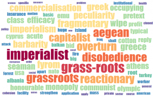
    Words overrepresented in the speeches of Greece MPs

    Words overrepresented in the speeches of Greece MPs

    A week ago me, Ilya and Alex happened to take part in a small data analysis hackathon, dedicated to the analysis of speech transcripts from the European Parliament. Somewhat analogously to DNA sequences, speeches can be grouped in various ways: you can group them by the speaker who gave them, by country, gender or political party of that speaker, by the month or year when the speech was given or by any combination of such groupings. The obvious "features" of a speech are words, which can be either present or not present in it. Once you view the problem this way the task of finding group-specific words becomes self-evident and the Fisher test is the natural solution to it. We implemented this idea and extracted "country-specific" and "time-specific" words from the speeches (other options were left out due to time constraints). As is usual the case with my favourite method, the obtained results look relevant, informative and, when shown in the form of a word cloud, fun. Check them out.

    The complete source code of the analysis scripts and the visualization application is available on Github.


    Tags: , , , , , , ,

  • Posted by Konstantin 25.02.2013 9 Comments

    Most of bioinformatics revolves, in one way or another, around the genome. Even in the largely "non-genomic" areas, such as systems biologyproteomics, or metabolomics, the key players are still genes, proteins, and their regulatory regions, which can be associated with particular points on the genome. Consequently, no matter what kind of data you work with, if you do bioinformatics, you will sooner or later have to deal with genomic coordinates.

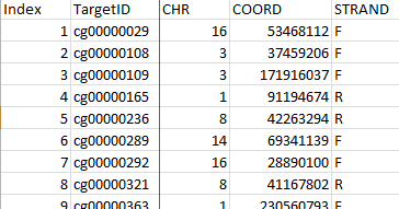
    To interpret genomic coordinates you need to know the reference genome version and coordinate conventions used. Does the data file mention those?

    To interpret genomic coordinates you need to know the reference genome version and coordinate conventions used. Does the data file mention those?

    Surprisingly, despite being of such central importance to bioinformatics, the whole genomic coordinate business seems to be in a rather unfriendly state nowadays. Firstly, there are several ways to refer to genomic positions (e.g. 0-based vs 1-based indexing), and for every possible combination of conventions, there is at least one file format that will be using it. Then, of course, you have to deal with several versions of the reference genome, and, to make your life harder yet, most data files will not tell you what genome version should be used to interpret the coordinates stored there. Finally, if you decide that you need to unify the coordinates among your different data files by converting them to the same reference genome version, you will find out that your only tools here are a couple of heavyweight web apps and a command-line UCSC liftOver utility. Should you look for R or Python libraries to script your task, you will discover that those do no smarter than forward all the conversion tasks to that same liftOver.

    I found this is all to be extremely wrong and hacked up a tiny Python tool recently, which will happily convert your coordinates without the need to invoke an external liftOver process. It does not fully replace liftOver (yet?), as it does not convert regions - a task just a bit more tricky than lifting over single points. However it lets you do single-point conversion in the simplest way possible:

    from pyliftover import LiftOver
    lo = LiftOver('hg17', 'hg18')
    lo.convert_coordinate('chr1', 1000000, '-') # 0-based indexing

    As usual, install via: easy_install pyliftover (or pip install pyliftover)

    For more information consult the PyPI page.

    Tags: , , , ,

  • Posted by Konstantin 13.10.2012 38 Comments

    I have recently discovered that simple Venn diagrams are surprisingly popular in bioinformatics. So popular they are, in fact, that there are several bioinformatics research papers devoted solely to their use. And those are highly accessed papers, let me add! Yet, despite this wild popularity, tools that let you render a decent Venn diagram programmatically seem to be rather scarce.

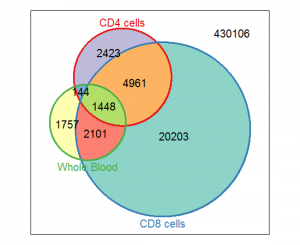
    Vennerable plot

    Vennerable plot

    If you google a bit, you will find a bunch of on-line tools of varying degrees of quality and ability (1, 2, 3, 4, 5, 6, 7, 8, 9,...), a Java-based tool,  a Perl library, a couple of Python scripts (1, 2), some R libraries (1, 2, 3, 4, 5), and lots of forum discussions. Seems to be plenty, doesn't it? Well, it turns out that if you want your diagram to be area-weighted (i.e. the regions of the diagram should be roughly proportional to the corresponding set sizes), 4 of those 18 links won't do. If you want to generate and configure the diagram conveniently from a script, drop another 9. Then, if you want the diagram to look nice, drop 4 more, and all you are left with is the Vennerable R package. Unfortunately, Vennerable plots are still a pain to configure — even adding a plot title seems to be very tricky, not speaking of highlighting and annotating a region on the diagram.

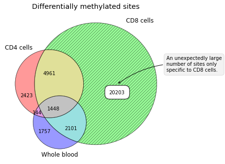
    Having been totally disappointed in the state of the art of contemporary Venn-diagramming tools, I made a small Python package for drawing Venn diagrams that has the necessary flexibility. At least it lets me put plot titles and annotate diagram regions as I fancy.


    Matplotlib-venn plot

    Matplotlib-venn plot


    Package installation goes by the standard method: easy_install matplotlib-venn

    For basic usage examples, consult the PyPI page.

    Tags: , , , ,