Basic linear algebra, introductory statistics and some familiarity with core machine learning concepts (such as PCA and linear models) are the prerequisites of this post. Otherwise it will probably make no sense. An abridged version of this text is also posted on Quora.
Most textbooks on statistics cover covariance right in their first chapters. It is defined as a useful "measure of dependency" between two random variables:
![\[\mathrm{cov}(X,Y) = E[(X - E[X])(Y - E[Y])].\]](https://fouryears.eu/wp-content/ql-cache/quicklatex.com-1831261b0c8298b6a3d12ddea0042089_l3.png "Rendered by QuickLaTeX.com")
The textbook would usually provide some intuition on why it is defined as it is, prove a couple of properties, such as bilinearity, define the covariance matrix for multiple variables as  , and stop there. Later on the covariance matrix would pop up here and there in seeminly random ways. In one place you would have to take its inverse, in another - compute the eigenvectors, or multiply a vector by it, or do something else for no apparent reason apart from "that's the solution we came up with by solving an optimization task".
In reality, though, there are some very good and quite intuitive reasons for why the covariance matrix appears in various techniques in one or another way. This post aims to show that, illustrating some curious corners of linear algebra in the process.
Meet the Normal Distribution
The best way to truly understand the covariance matrix is to forget the textbook definitions completely and depart from a different point instead. Namely, from the the definition of the multivariate Gaussian distribution:
We say that the vector  has a normal (or Gaussian) distribution with mean
  and covariance
  if:
if:
![\[\Pr({\bf x}) =|2\pi{\bf\Sigma}|^{-1/2} \exp\left(-\frac{1}{2}({\bf x} - {\bf\mu})^T{\bf\Sigma}^{-1}({\bf x} - {\bf \mu})\right).\]](https://fouryears.eu/wp-content/ql-cache/quicklatex.com-c72dc0af31078a6b5c06ca187d4dd3e6_l3.png "Rendered by QuickLaTeX.com")
To simplify the math a bit, we will limit ourselves to the centered distribution (i.e.  ) and refrain from writing out the normalizing constant
  . Now, the definition of the (centered) multivariate Gaussian looks as follows:
![\[\Pr({\bf x}) \propto \exp\left(-0.5{\bf x}^T{\bf\Sigma}^{-1}{\bf x}\right).\]](https://fouryears.eu/wp-content/ql-cache/quicklatex.com-a5145d00c2add0f3651f234371825cbc_l3.png "Rendered by QuickLaTeX.com")
Much simpler, isn't it? Finally, let us define the covariance matrix as nothing else but the parameter of the Gaussian distribution. That's it. You will see where it will lead us in a moment.
Transforming the Symmetric Gaussian
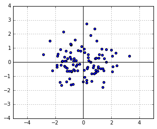
Consider a symmetric Gaussian distribution, i.e. the one with  (the identity matrix). Let us take a sample from it, which will of course be a symmetric, round cloud of points:
We know from above that the likelihood of each point in this sample is
(1) ![\[P({\bf x}) \propto \exp(-0.5 {\bf x}^T {\bf x}).\]](https://fouryears.eu/wp-content/ql-cache/quicklatex.com-8a2ea394bef3046bc7e53d585738a238_l3.png "Rendered by QuickLaTeX.com")
Now let us apply a linear transformation  to the points, i.e. let
  . Suppose that, for the sake of this example, scales the vertical axis by 0.5 and then rotates everything by 30 degrees. We will get the following new cloud of points
  :
:
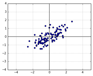
What is the distribution of ? Just substitute  into (1), to get:
(2) 
This is exactly the Gaussian distribution with covariance  . The logic works both ways: if we have a Gaussian distribution with covariance , we can regard it as a distribution which was obtained by transforming the symmetric Gaussian by some
  , and we are given
  .
.
More generally, if we have any data, then, when we compute its covariance to be  , we can say that if our data were Gaussian, then it could have been obtained from a symmetric cloud using some transformation
  , and we just estimated the matrix , corresponding to this transformation.
Note that we do not know the actual , and it is mathematically totally fair. There can be many different transformations of the symmetric Gaussian which result in the same distribution shape. For example, if is just a rotation by some angle, the transformation does not affect the shape of the distribution at all. Correspondingly,  for all rotation matrices. When we see a unit covariance matrix we really do not know, whether it is the “originally symmetric” distribution, or a “rotated symmetric distribution”. And we should not really care - those two are identical.
There is a theorem in linear algebra, which says that any symmetric matrix can be represented as:
(3) ![\[{\bf \Sigma} = {\bf VDV}^T,\]](https://fouryears.eu/wp-content/ql-cache/quicklatex.com-77a7920779e813aa9d2a69434934a91c_l3.png "Rendered by QuickLaTeX.com")
where  is orthogonal (i.e. a rotation) and
  is diagonal (i.e. a coordinate-wise scaling). If we rewrite it slightly, we will get:
(4) ![\[{\bf \Sigma} = ({\bf VD}^{1/2})({\bf VD}^{1/2})^T = {\bf AA}^T,\]](https://fouryears.eu/wp-content/ql-cache/quicklatex.com-2e20d88c4a3f98b68c62c23a2538d7a6_l3.png "Rendered by QuickLaTeX.com")
where  . This, in simple words, means that any covariance matrix could have been the result of transforming the data using a coordinate-wise scaling
  followed by a rotation
  . Just like in our example with and
  above.
Principal Component Analysis
Given the above intuition, PCA already becomes a very obvious technique. Suppose we are given some data. Let us assume (or “pretend”) it came from a normal distribution, and let us ask the following questions:
- What could have been the rotation and scaling , which produced our data from a symmetric cloud?
- What were the original, “symmetric-cloud” coordinates before this transformation was applied.
- Which original coordinates were scaled the most by
 and thus contribute most to the spread of the data now. Can we only leave those and throw the rest out?
All of those questions can be answered in a straightforward manner if we just decompose into and according to (3). But (3) is exactly the eigenvalue decomposition of . I’ll leave you to think for just a bit and you’ll see how this observation lets you derive everything there is about PCA and more.
The Metric Tensor
Bear me for just a bit more. One way to summarize the observations above is to say that we can (and should) regard  as a metric tensor. A metric tensor is just a fancy formal name for a matrix, which summarizes the deformation of space. However, rather than claiming that it in some sense determines a particular transformation (which it does not, as we saw), we shall say that it affects the way we compute angles and distances in our transformed space.
Namely, let us redefine, for any two vectors  and
and  , their inner product as:
(5) ![\[\langle {\bf v}, {\bf w}\rangle_{\Sigma^{-1}} = {\bf v}^T{\bf \Sigma}^{-1}{\bf w}.\]](https://fouryears.eu/wp-content/ql-cache/quicklatex.com-ccde20d05d63e8aeddefc2f4e97c1bab_l3.png "Rendered by QuickLaTeX.com")
To stay consistent we will also need to redefine the norm of any vector as
(6) ![\[|{\bf v}|_{\Sigma^{-1}} = \sqrt{{\bf v}^T{\bf \Sigma}^{-1}{\bf v}},\]](https://fouryears.eu/wp-content/ql-cache/quicklatex.com-f724b1da4af1628a260d50940cbee9d0_l3.png "Rendered by QuickLaTeX.com")
and the distance between any two vectors as
(7) ![\[|{\bf v}-{\bf w}|_{\Sigma^{-1}} = \sqrt{({\bf v}-{\bf w})^T{\bf \Sigma}^{-1}({\bf v}-{\bf w})}.\]](https://fouryears.eu/wp-content/ql-cache/quicklatex.com-99ad5ced1b604342ad5cd31d96b9c77a_l3.png "Rendered by QuickLaTeX.com")
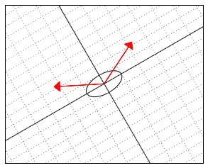
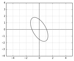
Those definitions now describe a kind of a “skewed world” of points. For example, a unit circle (a set of points with “skewed distance” 1 to the center) in this world might look as follows:
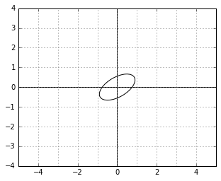 And here is an example of two vectors, which are considered “orthogonal”, a.k.a. “perpendicular” in this strange world:
Although it may look weird at first, note that the new inner product we defined is actually just the dot product of the “untransformed” originals of the vectors:
(8) ![\[{\bf v}^T{\bf \Sigma}^{-1}{\bf w} = {\bf v}^T({\bf AA}^T)^{-1}{\bf w}=({\bf A}^{-1}{\bf v})^T({\bf A}^{-1}{\bf w}),\]](https://fouryears.eu/wp-content/ql-cache/quicklatex.com-de617b8c6664fb235e0fbc97b63fb9a3_l3.png "Rendered by QuickLaTeX.com")
The following illustration might shed light on what is actually happening in this  -“skewed” world. Somehow “deep down inside”, the ellipse thinks of itself as a circle and the two vectors behave as if they were (2,2) and (-2,2).
Getting back to our example with the transformed points, we could now say that the point-cloud is actually a perfectly round and symmetric cloud “deep down inside”, it just happens to live in a skewed space. The deformation of this space is described by the tensor (which is, as we know, equal to  . The PCA now becomes a method for analyzing the deformation of space, how cool is that.
The Dual Space
We are not done yet. There’s one interesting property of “skewed” spaces worth knowing about. Namely, the elements of their dual space have a particular form. No worries, I’ll explain in a second.
Let us forget the whole skewed space story for a moment, and get back to the usual inner product  . Think of this inner product as a function
  , which takes a vector and maps it to a real number, the dot product of and . Regard the here as the parameter (“weight vector”) of the function. If you have done any machine learning at all, you have certainly come across such linear functionals over and over, sometimes in disguise. Now, the set of all possible linear functionals
  is known as the dual space to your “data space”.
Note that each linear functional is determined uniquely by the parameter vector , which has the same dimensionality as , so apparently the dual space is in some sense equivalent to your data space - just the interpretation is different. An element of your “data space” denotes, well, a data point. An element of the dual space denotes a function , which projects your data points on the direction (recall that if is unit-length, is exactly the length of the perpendicular projection of upon the direction ). So, in some sense, if -s are “vectors”, -s are “directions, perpendicular to these vectors”. Another way to understand the difference is to note that if, say, the elements of your data points numerically correspond to amounts in kilograms, the elements of would have to correspond to “units per kilogram”. Still with me?
Let us now get back to the skewed space. If are elements of a skewed Euclidean space with the metric tensor , is a function  an element of a dual space? Yes, it is, because, after all, it is a linear functional. However, the parameterization of this function is inconvenient, because, due to the skewed tensor, we cannot interpret it as projecting vectors upon nor can we say that is an “orthogonal direction” (to a separating hyperplane of a classifier, for example). Because, remember, in the skewed space it is not true that orthogonal vectors satisfy
  . Instead, they satisfy
  . Things would therefore look much better if we parameterized our dual space differently. Namely, by considering linear functionals of the form
  . The new parameters
  could now indeed be interpreted as an “orthogonal direction” and things overall would make more sense.
However when we work with actual machine learning models, we still prefer to have our functions in the simple form of a dot product, i.e. , without any ugly -s inside. What happens if we turn a “skewed space” linear functional from its natural representation into a simple inner product?
(9) ![\[f^{\Sigma^{-1}}_{\bf z}({\bf v}) = {\bf z}^T{\bf\Sigma}^{-1}{\bf v} = ({\bf \Sigma}^{-1}{\bf z})^T{\bf v} = f_{\bf w}({\bf v}),\]](https://fouryears.eu/wp-content/ql-cache/quicklatex.com-84091d56adccf60763a2162ec33ba4bf_l3.png "Rendered by QuickLaTeX.com")
where  . (Note that we can lose the transpose because is symmetric).
What it means, in simple terms, is that when you fit linear models in a skewed space, your resulting weight vectors will always be of the form  . Or, in other words, is a transformation, which maps from “skewed perpendiculars” to “true perpendiculars”. Let me show you what this means visually.
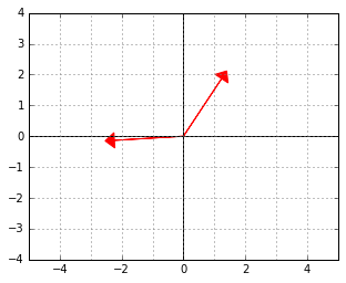
Consider again the two “orthogonal” vectors from the skewed world example above:
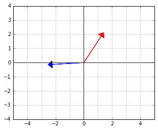
Let us interpret the blue vector as an element of the dual space. That is, it is the vector in a linear functional  . The red vector is an element of the “data space”, which would be mapped to 0 by this functional (because the two vectors are “orthogonal”, remember).
For example, if the blue vector was meant to be a linear classifier, it would have its separating line along the red vector, just like that:
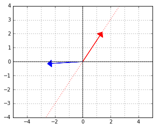
If we now wanted to use this classifier, we could, of course, work in the “skewed space” and use the expression to evaluate the functional. However, why don’t we find the actual normal to that red separating line so that we wouldn’t need to do an extra matrix multiplication every time we use the function?
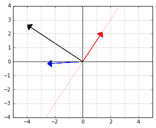
It is not too hard to see that  will give us that normal. Here it is, the black arrow:
Therefore, next time, whenever you see expressions like  or
or  , remember that those are simply inner products and (squared) distances in a skewed space, while is a conversion from a skewed normal to a true normal. Also remember that the “skew” was estimated by pretending that the data were normally-distributed.
Once you see it, the role of the covariance matrix in some methods like the Fisher’s discriminant or Canonical correlation analysis might become much more obvious.
The Dual Space Metric Tensor
“But wait”, you should say here. “You have been talking about expressions like all the time, while things like  are also quite common in practice. What about those?”
Hopefully you know enough now to suspect that is again an inner product or a squared norm in some deformed space, just not the “internal data metric space”, that we considered so far. Which space is it? It turns out it is the “internal dual metric space”. That is, whilst the expression denoted the “new inner product” between the points, the expression denotes the “new inner product” between the parameter vectors. Let us see why it is so.
Consider an example again. Suppose that our space transformation scaled all points by 2 along the  axis. The point (1,0) became (2,0), the point (3, 1) became (6, 1), etc. Think of it as changing the units of measurement - before we measured the axis in kilograms, and now we measure it in pounds. Consequently, the norm of the point (2,0) according to the new metric,
  will be 1, because 2 pounds is still just 1 kilogram “deep down inside”.
What should happen to the parameter ("direction") vectors due to this transformation? Can we say that the parameter vector (1,0) also got scaled to (2,0) and that the norm of the parameter vector (2,0) is now therefore also 1? No! Recall that if our initial data denoted kilograms, our dual vectors must have denoted “units per kilogram”. After the transformation they will be denoting “units per pound”, correspondingly. To stay consistent we must therefore convert the parameter vector (”1 unit per kilogram”, 0) to its equivalent (“0.5 units per pound”,0). Consequently, the norm of the parameter vector (0.5,0) in the new metric will be 1 and, by the same logic, the norm of the dual vector (2,0) in the new metric must be 4. You see, the “importance of a parameter/direction” gets scaled inversely to the “importance of data” along that parameter or direction.
More formally, if  , then
(10) 
This means, that the transformation of the data points implies the transformation  of the dual vectors. The metric tensor for the dual space must thus be:
(11) ![\[({\bf BB}^T)^{-1}=(({\bf A}^{-1})^T{\bf A}^{-1})^{-1}={\bf AA}^T={\bf \Sigma}.\]](https://fouryears.eu/wp-content/ql-cache/quicklatex.com-30e0bda6d93e7e5c5d06f3ee12f89c77_l3.png "Rendered by QuickLaTeX.com")
Remember the illustration of the “unit circle” in the  metric? This is how the unit circle looks in the corresponding metric. It is rotated by the same angle, but it is stretched in the direction where it was squished before.
Intuitively, the norm (“importance”) of the dual vectors along the directions in which the data was stretched by becomes proportionally larger (note that the “unit circle” is, on the contrary, “squished” along those directions).
But the “stretch” of the space deformation in any direction can be measured by the variance of the data. It is therefore not a coincidence that  is exactly the variance of the data along the direction (assuming
  ).
).
The Covariance Estimate
Once we start viewing the covariance matrix as a transformation-driven metric tensor, many things become clearer, but one thing becomes extremely puzzling: why is the inverse covariance of the data a good estimate for that metric tensor? After all, it is not obvious that  (where
  is the data matrix) must be related to the in the distribution equation
  .
.
Here is one possible way to see the connection. Firstly, let us take it for granted that if is sampled from a symmetric Gaussian, then is, on average, a unit matrix. This has nothing to do with transformations, but just a consequence of pairwise independence of variables in the symmetric Gaussian.
Now, consider the transformed data,  (vectors in the data matrix are row-wise, hence the multiplication on the right with a transpose). What is the covariance estimate of
  ?
?
(12) ![\[{\bf Y}^T{\bf Y}/n=({\bf XA}^T)^T{\bf XA}^T/n={\bf A}({\bf X}^T{\bf X}){\bf A}^T/n\approx {\bf AA}^T,\]](https://fouryears.eu/wp-content/ql-cache/quicklatex.com-7fe9f5f8b90f6c7b79a42c9aaf5aa003_l3.png "Rendered by QuickLaTeX.com")
the familiar tensor.
This is a place where one could see that a covariance matrix may make sense outside the context of a Gaussian distribution, after all. Indeed, if you assume that your data was generated from any distribution  with uncorrelated variables of unit variance and then transformed using some matrix , the expression will still be an estimate of , the metric tensor for the corresponding (dual) space deformation.
However, note that out of all possible initial distributions , the normal distribution is exactly the one with the maximum entropy, i.e. the “most generic”. Thus, if you base your analysis on the mean and the covariance matrix (which is what you do with PCA, for example), you could just as well assume your data to be normally distributed. In fact, a good rule of thumb is to remember, that whenever you even mention the word "covariance matrix", you are implicitly fitting a Gaussian distribution to your data.
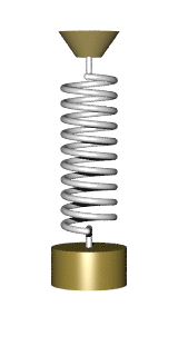
 in the relaxed state, and if we stretch it, making it longer by
  , the two ends of the spring exert a contracting force of
  . Assume we hold the top of the spring at the vertical coordinate
  and have it balance out. The lower end will then position at the coordinate
  , where the gravity force
  is balanced out exactly by the spring force.
 . Recall the corresponding Taylor expansion:
![\[\cos(x) = 1 - \frac{x^2}{2} + \frac{x^4}{24} + \dots \approx 1 - \frac{x^2}{2}.\]](https://fouryears.eu/wp-content/ql-cache/quicklatex.com-3414db091e89e7a357cc8138d6246d9a_l3.png "Rendered by QuickLaTeX.com")
 and
and  respectively. The continuous slinky will have infinitely many points numbered
 ![[0,1]](https://fouryears.eu/wp-content/ql-cache/quicklatex.com-25b6d943ab489c05a3dbd5ea29087a48_l3.png "Rendered by QuickLaTeX.com") .
. denote the vertical coordinate of a point
  . The acceleration of point
  , and there are two components affecting it: the gravitational pull
  and the force of the spring.
 . As each point is affected by the stretch from above and below, we have to consider a difference of the "top" and "bottom" stretches, which is thus
  . Consequently, the dynamics of the slinky can be described by the equation:
![\[\frac{\partial^2 h(x,t)}{\partial^2 t} = a\frac{\partial^2 h(x,t)}{\partial^2 x} - g.\]](https://fouryears.eu/wp-content/ql-cache/quicklatex.com-07981484366a38e2319cdf98ce1c32e7_l3.png "Rendered by QuickLaTeX.com")
 is some positive constant. Let us denote the second derivatives by
  and
and  , replace
  and rearrange to get:
![\[h_{tt} - v^2 h_{xx} = -g,\]](https://fouryears.eu/wp-content/ql-cache/quicklatex.com-7d6dfe9bb994d93c9acd422979ca2a70_l3.png "Rendered by QuickLaTeX.com")
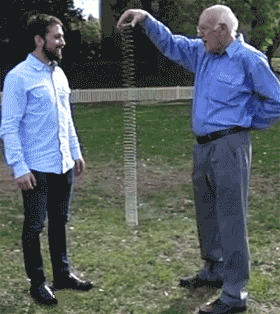
 through some medium. In our case the medium will be the slinky itself. Now it becomes apparent that, indeed, the lower end of the slinky should not move before the wave of disturbance, unleashed by releasing the top end, reaches it. Most of the explanations of the slinky drop seem to refer to that fact. However when it is stated alone, without the wave-equation-model context, it is at best a rather incomplete explanation.
 (because it is not moving at all),
  (because the top end is located at coordinate 0), and
  (because there is no stretch at the bottom). Combining this with (1) and searching for a polynomial solution, we get:
![\[h(x, t) = h_0(x) = \frac{g}{2v^2}x(x-2).\]](https://fouryears.eu/wp-content/ql-cache/quicklatex.com-ccb537e0ac9d6c0c9c1419a5e3779cea_l3.png "Rendered by QuickLaTeX.com")
 and
and  disappear and we may use the
 ![\[h(x,t) = \frac{1}{2}(\phi(x-vt) + \phi(x+vt)) - \frac{gt^2}{2},\]](https://fouryears.eu/wp-content/ql-cache/quicklatex.com-162c239646d7b38385bb3c3b22e162f9_l3.png "Rendered by QuickLaTeX.com")
![\[\text{ where }\phi(x) = h_0(\mathrm{mod}(x, 2)).\]](https://fouryears.eu/wp-content/ql-cache/quicklatex.com-74110cd0e6bc77fb53f780a68a1fefca_l3.png "Rendered by QuickLaTeX.com")
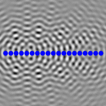
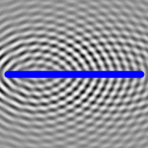
 and phase
  and the wave from the second source reaches the pixel with amplitude
  and phase
  . The two waves add up, so the pixel "feels" the overall oscillation of the form
![\[a_1 \sin(ft + b_1) + a_2 \sin(ft + b_2).\]](https://fouryears.eu/wp-content/ql-cache/quicklatex.com-6291a8d39fb06066e62dd7a359aa13e6_l3.png "Rendered by QuickLaTeX.com")
 . Hence, to "record" the oscillation of each "pixel-buoy" we must store only two parameters: its intensity and phase.
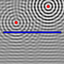


")

 will provide you with an informative coordinate projection function
  . This is a natural "supervised" alternative to kernel-PCA or SOM.